Tag Archives: Mod Podge

Aspic is not a thing to do in public

Standard

I have been very social this weekend, and now I am tired.

But I thought I’d comment on a couple of nice things that have happened lately. My friend/coworker and I went out to dinner Friday after work at one of our local favorite restaurants. One of the owners, whom I’d told about this blog, came over to say how much she’s enjoying it and how funny it is, and that she’d gotten some of her employees reading it too. It totally made my day. And it made me think about the Julie/Julia Project, one of the inspirations for this blog. I would never have known about it if my friend/boss from another job, Susan, hadn’t told me about it as Julie Powell’s year was unfolding. We dug into it every day and chatted about Julie’s latest disaster or triumph or the general insanity of making aspic five days in a row for dinner, especially when you hate aspic. So it’s a tribute to Susan, who passed away a couple of weeks ago, that I’m doing a similar unhinged project. And it’s exciting to think there’s a little of that chatting over what’s going on in this space, just as Julie got us talking about cooking and kitchen disasters and whatever.

(Miss you, Susan. Feeling very nostalgic over those chats and others in your cube, which had the great view of Idaho and mountains behind our campus. And one time, a moose, which I think was the first I’d ever seen.)

Another nice thing: I was wearing my mod-podged shoes last night at the outdoor theater in a nearby county, and was drive-by fangirled. I actually was digging in my purse and missed what the ladies said, but my companion signal-boosted that for me. They are showing some charming wear, but I still get compliments on them. (They could use a little more glue in spots, though.)

Also: My brother, future sis-in-law and her niece met me and my regular theater companion for brunch this morning, and then we went to the thrift shop in town, and after that to the indoor flea market. Future sis-in-law admired and decided to buy a craft item I had for sale (most of my booth is household stuff I’m letting go of, but I put up a few items from the art show I participated in a few weeks ago) before she realized it was something I made. Cool! I also found out I’d had a good month again this time out (after a couple of weeks where I had nothing but crafts up and made next to nothing), so after my initial up-front rent payment, I’ve managed to pay next month’s rent out of proceeds and make a little profit besides. And hey, I got my check from the art show, and it’s the best year I’ve had there, too.

So I’m feeling the love, and am very grateful and happy about that.
Advertisement

Are your papers in order?

Standard
Are your papers in order?

When I travel, I still like having my flight stuff on pieces of paper, even though it’s electronic all the way. And you may have noticed a good many airlines save money by not even giving you a little envelope with your gate number marked on it and your boarding pass tucked inside. I like having an envelope with all my documents in it that’s not just a plain white envelope, so when I reach into the chaos that is generally my purse, it’s readily findable. I used to have a pack of long envelopes with a rose design all over them (and a lighter color box in the area where you write the address), but they’ve been depleted after a few years of travel.*

So I just got back from a visit to my longtime friend who lives in the DC area, and my project of the week (last week, ahem) was a pair of envelopes that are made from cute template giveaways on the Hermes website. Found the link on Pinterest, which will come as no surprise to anyone.

The templates are paper clutches called Jigé, an envelope style with side panels that let it open outward a bit, and a tab that goes into an H shaped 3-D clasp. There are several premade designs you can download, as well as a blank one you can design yourself. I decided to make a couple of these as my travel envelopes.

Is it cheating if my craft is cutting out a template, gluing it together and mod podging the whole thing? So be it. Travel weeks are hard. Maybe at some point I’ll do the blank one and tart that up some with Zentangles or collage or something.

So the template prints out on 2 pages, like so:

Body of clutch

Side pieces and clasp pieces

I did some serious rassling with the clasp bits. On one version of the clutch I missed the little blue lines that indicated I should cut little slits on the body of the bag where the H-shaped piece goes. And as it turned out, the one I messed up was far easier to deal with. There was plenty of space for the long tab to slip through (too much, really, to keep the clutch secured), but when I did do the little slits on the clutch and slipped the back tabs of the H piece into it, I couldn’t get the tab in at all. So gluing the piece without slipping any tabs through the little slits seems to work best.

(All the guesswork in this post is due to the fact that there aren’t instructions for how things should be assembled, just a little legend that shows you which lines to fold and which to cut, and where to glue.)

The clasp bit gets the most folding, and winds up a 3-D piece when you get it done.

WHAT THE H?

H yeah, almost done.

Fold fold fold, glue glue glue.

Together at last.

Then I slathered the whole thing with Mod Podge, so it would hold together a little better in transit and usage.

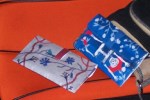
And here are the two clutches I made. The one on the left is the one where I think I did things according to … well, no directions, but where I made the cuts. The right is the one where I didn’t see the cut lines and just glued the clasp on. You can see which clasp actually worked, can’t you?

They got a little battered because the shoulder bag I was using was too small, but they held up decently for paper. One of them had the tab come off, and truthfully, I think I’d rather make a version without the tab and clasp at all. A little dot of sticky Velcro or something would hold it together just fine without the tearing paper, I think. But someone out there might have better luck interpreting how the thing is supposed to be assembled and have a better result.

From what I can tell, there’s not a direct link to the templates, but here’s a way to get there:
http://lesailes.hermes.com/us/en/
After some animated stuff, there will be a grid of pictures without explanation. In the center is an orange circle. Two squares to the right should be an image of a hand and a white bag with the words “I want it, I’ll have it!” Click on that, and you’ll find the templates for the different clutches. You might want to grab them sooner rather than later; Hermes apparently had a previous paper template bag that is no longer available.

And here’s a better look:

I am a sucker for Day of the Dead images, so that’s the other one I made. Cute printed on stitches around the edges make them both look like more work than they were.

*The envelopes get quite battered after a trip to and from, but I’ve saved some of the used envelopes to incorporate rose designs into collaged boxes that I’ve made as gifts. The creases and worn edges add a nice element of age to the project.

When Worlds Collage

Standard
When Worlds Collage

So hey, for once I’m not drag-assing in here at the last minute. I made this thing Wednesday and Thursday, and I’m pretty pleased with it.

It’s already been delivered to its destination. It’s a hand-made card made up of 3 collages, announcing to my friend and coworker that she’s getting an official Random Act of Kindness bestowed on her. For those who are just dropping in or haven’t seen any of my previous posts about Random Acts, it’s a non-profit organization that was dreamed up by actor Misha Collins and made reality with the help of people with mad non-profit organization skillz. It encourages acts of kindness on large scale (a trip to Haiti with a couple of dozen volunteers to help out a clinic and orphanage, which is going on right now) and small, and funds various cool things. I’ve sent in a few proposals, and finally got the go-ahead and the funding to do a project. In celebration of my friend, who gives up evenings, weekends and even vacation time to lead a Boy Scout troop and be on hand at the camps, and also hosted an exchange student for the past 9 months (and I never knew what a huge undertaking that is until now), I get to take her out for a day of pampering — mini-spa day plus a fancy dinner.

My original plan was to spring this on her as a suprise after luring her somewhere on the pretense of helping me with something, because that’s another thing about her that I wanted to celebrate too. She’s even loaned me her car for several days when mine was in the shop. But it finally occurred to me, in the immortal words of Boromir, “One does not simply kidnap one’s friend for a spa day.” And saying you need help with something “and be sure to shave yer legs” is just WEIRD. So I decided I must issue a spoiler for the occasion, but make it an occasion. I mulled over exactly what kind of card to make — I already had decided on the wording but needed to figure out what images to pair with it. I’m very fond of making collages, so I played with some images that were suggested by words I was using, and I raided my stash of awesome papers. And I played with fonts until I found a few that worked with each phrase I wanted to illustrate.

Epic Mod Podging ensued.

Page 1 is kind of a semi-private joke. (Which run about half the cost of a private joke, so it was more in line with my budget.)

Surprise!

“Shock and awe” is a great phrase, and I planned on using an image from the first Gulf War (where the phrase originated; it was the code name for the US war effort), but then in the middle of paste-up I started feeling hesitant about using bombing images — and, well, that pretty much WAS the first Gulf War. So I whipped out my trusty art book which I got for $1 because it was damaged (actually I got something like 5 of the same book, because y’know, collage) and started leafing through for images. Lo and behold, I found Martini’s Annunciation, which I saw in Italy and is one of my fave Annunciations. I mean, awe is the expected response here, but there’s such an air of pissiness in that look between Gabriel and the Virgin Mary, and just WHAT.

Why the stink eye?

So I pasted them onto the bombing photo (which I guess qualifies as actual photobombing) and did a little more leafing through the art book until I found a picture of two little boys peeping at people in a park. I gave the trees a bit of a trim (ahem) and put them in prime gawking position. There’s kind of a lightning bolt thing, too, which is the remnant of an apocalyptic painting on the reverse of Mary and Gabriel’s page. Decisions, decisions.

No shocker jokes here.

I had thought about grabbing some suitably bizarre picture(s) of Misha Collins off the internet for page 3, to go with Random and Awesome. But my printer was running low on colored ink, so all that came out was Misha’s shirt. I’m nothing if not adaptable, so I rummaged through some scans of Victorian ephemera I had made for a GISHWHES project. The Victorians were not only random but really kind of creepy and disturbing, and lo, I found this weird baby king with a duck on his head holding court with these two other babies with … something … on their heads.

We told you it was a random act.

The last little bit is one of my last pieces of Kinukinaya stationery (it’s this humongous Japanese bookstore in NYC, which has pens and stationery sets to DIE for) tucked away in an envelope, describing what the Random Act is all about. Sparkle paint was liberally applied to the envelope.

Then, since I had some tracing paper I had bought for another project, I decided to protect each page with a sheet. Automatic classiness!!! Then I punched holes and tied it together with yarn.

And then I delivered it, and it was appreciated not only for the message but for the weird me-ness of it , hurray. And cutting stuff up out of things you’re not normally supposed to cut up, and then pasting them down, is a pretty good stress-reliever, too.

Man, I miss Kinukinaya. Would love to go through there with an unlimited wad of cash to get my paper and pen freak on.

Number Nine…Number Nine…Project #9

Standard
Number Nine…Number Nine…Project #9

Perfectly awesome, y/y?

As promised, no felt on this week’s project. This one was decided on impulse, when I started thinking about shoes for travel. I’ve seen a couple of interesting things on Pinterest lately: painted shoes and collaged shoes. I thought of the perfect pair for this project: I have this wonderful pair of clogs — cushy, comfortable and cool. The problem is I’ve pretty much worn them to death. They’re black fake leather with red fake reptile wingtips, and even once they were completely shabby I invariably got comments about how awesome they are. But the black has pretty much worn away, though if I remember right, the wingtips are still in good shape. So I had this bright idea to paint them. I was thinking sky blue with painted clouds on the black parts, and maybe liquid gold leaf on the wingtips.

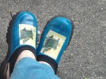
So of course I couldn’t find them. I do believe they’re somewhere — they’re too beloved to toss out without them looking WAY worse. But I found another pair of shoes, a cushy pair of clogs with a neoprene collar type thing that makes a strap across the heel. Comfortable, but pretty clodhopper-looking, so they look many years younger than their actual age. I didn’t think to photograph them before I started to pain them, so you’ll have to imagine a very dark brown, pebbly leather.

I took them and a bottle of neon blue acrylic paint to my art group, where I promptly appalled one of the women there. “You’re not going to paint them!” she said a time or two. “But they’re perfectly good shoes!” (We wear the same size, too, which probably made watching this desecration a little more painful.

But now they are perfectly awesome shoes.

Perfectly awesome, y/y?

Once I find the other pair of shoes, I have learned a few things of use. I will definitely need primer of some sort to get a pure color. I happen to like the teal that came from the combo of neon blue and dark brown, so I’m completely happy. But I dropped the whole sky idea and decided to decoupage something onto the shoes instead. Thought about something along the lines of a vintage picture from an old dictionary or encyclopedia, but nothing specific called my name and it seemed they’d be likely to be too small. So I leated through an art book I have that’s a small trim size but fairly fat, with a painting on every page. I found a bunch of them at a bookstore for $1 each because their spines were broken, so I bought several to hack up for art projects.

Found this one by Carel Fabritus:

The Goldfinch by Carel Fabritus

Because, you know: birds.

The other thing I learned, paper doesn’t really like to curve around shoes, and once curved, may not want to stay that way. As my foot beds the shoe, little cracks are appearing, but I actually like them. I will put a few more layers of varnish over them to preserve them, wrinkles and cracks and all.

Transformed from hardly-ever-wear to so-damn-cool-I-want-to-wear-them-all-the-time.

Cry Havoc and Let Slip the Dogs of Warhol

Standard
Cry Havoc and Let Slip the Dogs of Warhol

So yes, a perfect gift for my future sister-in-law. It finally clicked a day or two after I found this great tutorial on painting faux-Warhol portraits, hand painted instead of silk screened:

http://cathiefilian.blogspot.com/2009/02/make-it-artwork-la-warhol.html

Future SIL has a dog that she is just mad about, and the rest of the family finds Zoe adorable too. (And Zoe and my brother are nuts about each other, aww.) So I got my brother to email me some pictures of her, and he informed me that Zoe’s mama particularly loves pictures of her with her ears cocked forward.

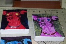
This project definitely strayed into I-cut-out-my-own-leaf territory (see my post on second grade art, “The Darkest Depths of Mordor”), both intentionally and unintentionally. My main departure from Cathie’s project is that I chose smaller canvases — a 2-ft. by 2-ft. commitment seems to be a lot to ask of another person’s decor. Plus I had four 5-in. by 4-in. canvases, which adds up to a much more reasonable 8 x 10. Most other departures were accidental. They made a difference, too, but I ended up liking this project a LOT anyway.

For one thing, I had trouble printing out the photo onto actual photo paper (I was too impatient to go through all the figuring out of settings and that, or to waste any more photo paper.), so instead of photocopying a print, I just printed out four originals onto regular paper. I don’t know if that affected my results or not.

It will surprise none of you who read my tale of second grade impetuousness that I JUST NOW discovered I used the wrong kind of brush in painting over the pictures once they were Mod Podged onto the canvas. The materials list says foam brushes, which I totally missed. ::forehead smack:: So there are brushstrokes I could not make go away. (I think they look a little worse in the photos than in person, but some colors were definitely streakier than others. And I wonder if the dark background made those parts tend toward streakiness anyway because of the ink coverage.) They don’t look exactly Warhol like, but I do think they look cool.

Zoe in progress

I decided to dab on a little iridescent gold paint onto the buckle of Zoe’s collar in each print, which gave me the brainstorm of using the same paint (Shiva Sticks oil paint crayons) around the canvas edges. This is a case in which I intentionally made it imperfect, drawing it across the edges and then smudging it into the canvas with my fingers. The two or three times I got a little streak of gold on the edge of the image itself, I left it there. It goes with the streaky look of the painting, and adds an energy to the piece, I think. Anyway, that’s my story and I’m sticking to it. After that, a few coats of varnish for acrylic and oil, and done!

Zoe x 4.

Like I said, it didn’t come out just like the tutorial (which looks pretty awesome), but I still like the result. Just for the hell of it I’ll have to try doing a canvas with the foam brush and see the difference that makes. And maybe next time read a little more closely when I’m diving into a tutorial project….