Tag Archives: paint

Now was that so hard?

Standard
Now was that so hard?

Well…sort of.

I got up first thing and took 2 pictures of my project and as I was cropping them on the computer I noticed something that’s barely noticeable on the actual thing, so I had to fix it. Did that, photographed it, and now I’m ready.

So, the project itself. This is one that started out in one of our women’s art gatherings. I’d brought another project to work on, but I saw what everyone else was doing, and I was all, “Ooooh, shiny!”

Literally, because we were using shiny silver metal tape [tm] to make fake pewter medallions. This was a project I’d seen done before (when I was also hell-bent on some other project) and thought was cool, so I jumped on the second chance. There’s a lot you can do with this method — adding them to altered Altoid tins (and I really would love to have a supply of these tins, but I am not a person who regularly sucks on mints), or make art cards of them, or do what I did here, adding it as a decorative element to a box.

The shiny silver metal tape [tm] can be found at hardware stores or places like WalMart. I hear there’s now a lookalike of plastic so you have to be careful you really have the metal type. It’s on a roll about the size of duct tape.

The big thing you can do with this tape (other than whatever its actual purpose might be) is play with texture. I’ve seen some very pretty cards made where it’s been taped onto card stock and then rolled through an embossing machine. But for this project we used pre-cut chipwood shapes and used little shaped paper punches on card stock. One of our group uses old plastic cards as her design base — used gift cards, stowaway hotel key cards and the like. Some of the group combined different shapes and came up with some really cool abstract designs. I found a paper punch with a tree design (probably for Christmas card projects) and decided to make a wee forest, and I chose a round chipwood precut as my base, since I decided to put it on a round paper mache box.

The box, by the way, was one of those items that sometimes appears in the stash of art materials in the famous back room at these art gatherings. Sometimes people start working on something and then lose interest, or they’re only there for one time (we get the occasional tourist passing through who comes to art night, which is pretty cool). So this box was one of those pieces, with a patchy coating of white paint. I kind of liked the effect, which made me think of birch bark, so I left it as it was. It could probably look more like birch bark, but I decided I’d rather have it be suggestive of such than be taken too far so it looks nothing like it.

On to the fake pewter! One of the regulars taught us this project, which she’d gotten from a show on HGTV before they switched their programming all around to appeal to a different demographic. Take your backing chipwood piece and glue on shapes of card stock or more chipwood, then carefully tape over the whole thing with your shiny silver metal tape [tm]. Your edges will overlap a little bit, but you want to rub them down so they’re hardly visible. We used orangewood sticks like you’d get in a manicure set. The same stick gets rubbed over the shapes around the edges so there’s some definition there. It takes a while to get the tape pushed down over a complex grouping of layers, but you want to be careful not to punch holes in the tape.

Once that’s done to your satisfaction, the next step is to etch some designs into the surface of your medallion. I went with some simpler Zen Tangle filler patterns, varying the patterns in different areas, as I would in a paper-and-ink Tangle. This part of the project I did a while back, so I can’t remember what I used to make the etched parts — something more pointed than the orange stick, but not so sharp it would tear the tape.

That’s as far as I got the night of the art gathering, and the box and the medallion have been sitting among my stash for a while. So finally I pulled it out and finished it, which was pretty simple. The last bit for the fake pewter is to brush on black paint so that it goes into the etched lines, then rub it off with a tissue so that the paint stays in the lines but mostly comes off the rest. It might take a few times to get it right so all the paint doesn’t come off, and if you rub too hard over the seam where the tape overlaps, it can curl up or wrinkle.

Painting in progress

So after the paint dried I glued the medallion piece onto the round box, and then it was done.

Done. At least I thought so.

So there was a spot that looking at it in person I thought might pass for a part of the fake wood, but that is one photo that screams “tiny coffee stain!” So this morning I grabbed some craft whitewash and a tissue and dabbed some one, and I think I’ve nailed it.

Happy little bats

Standard

So. The last 9 days, I was in Austin, Texas. Which was a completely kickass vacation, I’m pleased to say. The past year has been a bit rough in several ways, but this was a trip that made stress melt away. I got to have quiet mornings on the deck with a glass of iced coffee, got to meet up with online friends to do fun stuff, got to experience the special weirdness that Austin excels at, and meet amazingly friendly people. And eat fabulous food.

I got a couple different DCFG projects of mine fangirled, which was delightful — the painted/decoupaged shoes got several compliments, and the TARDIS kindle cozy could have gotten me a niche in a great little Austin store if not for the fact that I’m not from Texas.

And yes, even while racing around hearing music and shopping and thrift shopping, I did not forget my duty to create my weekly project. This time I had company while doing so. While looking through the do512.com site (if you’re ever going to Austin, it’s essential), I stumbled on the Austin franchise of Painting with a Twist. It’s a business that offers space and supplies to make a painting in one night, as a local artist guides you through the process.

Aprons and finished works.

You all work on the same painting, with different paintings offered on different days. The do512 listing showed thumbnails of each day’s painting, so I decided on mine at the beginning of the trip, figuring it would be a terrific souvenir: Starry Austin Night, which compressed the Austin skyline with Van Gogh swoops and swirls of stars behind it.

One paper plate held the colors we needed for the evening's work, and the other provided a palette for blending.

Oh, and I forgot the Twist part of Painting with a Twist. Each person can bring their own snacks and beer, wine or whatever, so it’s a party with a painting. (Our instructor told us his first group with that painting — we were the second — brought hard liquor and were stinking drunk and rowdy. Would love to see their works! Ours was pretty mellow.)

When we walked in our easels and paper-plate palettes were set up, and we got our 16″ x 24″ canvas when we paid. David, our instructor, led us through the process, giving us general guidelines for blending shades and spacing elements by finger-widths and stuff. There was a finished painting to reference, plus David painted a new one as he walked us through the process, and for some of the finer details, he used a white board to give us a closer look at what we should be doing.

I couldn’t help but think of the Happy Little Trees guy, and in fact, the comparison was acknowledged. Wish I’d taken a picture of it: there was a sketch of HLTG by David’s easel, with HIS NAME above and BOB ROSS below.

Despite the fact that we were working on the same image, there was a range of different looks to the students’ works, whether or not they wanted it. Periodically you’d hear little noises of frustration when a brushstroke didn’t go the way a painter wanted, and there was a lot of “I like yours, but mine…” I suspect, though, that the longer people lived with their own paintings, the better they liked them. Mine has grown on me. I originally planned to go back over a few spots but I’ve decided, to quote Anne Lamott, to leave it lay where Jesus flang it.

Smished skyline of Austin welcomes you!

Number Nine…Number Nine…Project #9

Standard
Number Nine…Number Nine…Project #9

Perfectly awesome, y/y?

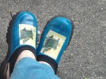
As promised, no felt on this week’s project. This one was decided on impulse, when I started thinking about shoes for travel. I’ve seen a couple of interesting things on Pinterest lately: painted shoes and collaged shoes. I thought of the perfect pair for this project: I have this wonderful pair of clogs — cushy, comfortable and cool. The problem is I’ve pretty much worn them to death. They’re black fake leather with red fake reptile wingtips, and even once they were completely shabby I invariably got comments about how awesome they are. But the black has pretty much worn away, though if I remember right, the wingtips are still in good shape. So I had this bright idea to paint them. I was thinking sky blue with painted clouds on the black parts, and maybe liquid gold leaf on the wingtips.

So of course I couldn’t find them. I do believe they’re somewhere — they’re too beloved to toss out without them looking WAY worse. But I found another pair of shoes, a cushy pair of clogs with a neoprene collar type thing that makes a strap across the heel. Comfortable, but pretty clodhopper-looking, so they look many years younger than their actual age. I didn’t think to photograph them before I started to pain them, so you’ll have to imagine a very dark brown, pebbly leather.

I took them and a bottle of neon blue acrylic paint to my art group, where I promptly appalled one of the women there. “You’re not going to paint them!” she said a time or two. “But they’re perfectly good shoes!” (We wear the same size, too, which probably made watching this desecration a little more painful.

But now they are perfectly awesome shoes.

Perfectly awesome, y/y?

Once I find the other pair of shoes, I have learned a few things of use. I will definitely need primer of some sort to get a pure color. I happen to like the teal that came from the combo of neon blue and dark brown, so I’m completely happy. But I dropped the whole sky idea and decided to decoupage something onto the shoes instead. Thought about something along the lines of a vintage picture from an old dictionary or encyclopedia, but nothing specific called my name and it seemed they’d be likely to be too small. So I leated through an art book I have that’s a small trim size but fairly fat, with a painting on every page. I found a bunch of them at a bookstore for $1 each because their spines were broken, so I bought several to hack up for art projects.

Found this one by Carel Fabritus:

The Goldfinch by Carel Fabritus

Because, you know: birds.

The other thing I learned, paper doesn’t really like to curve around shoes, and once curved, may not want to stay that way. As my foot beds the shoe, little cracks are appearing, but I actually like them. I will put a few more layers of varnish over them to preserve them, wrinkles and cracks and all.

Transformed from hardly-ever-wear to so-damn-cool-I-want-to-wear-them-all-the-time.

“MY GOD, IT’S FULL OF STARS”

Standard
“MY GOD, IT’S FULL OF STARS”

By the time this year is more than halfway through, I suspect the most-used tag will be Fixes for t-shirts I wrecked by dropping food on my rack.

This is the first. Though it was originally kinda ruined when I got bleach spots on the hip. How that occurred I can’t even tell you, since I don’t use bleach in my laundry. It’s a mystery. I was wearing it anyway under a cardigan, but then I dropped something on my rack (it’s always salad dressing or something that won’t quietly disappear in the wash — someone needs to write a scientific paper on the attraction of oily foods to the sizable rack).

So I found a tutorial through Pinterest where that begins with you spritzing bleach all over a black cotton tee, so it seemed like a natural. Plus, it looks really amazing.

You can find the tutorial here:

http://treasuresandtravels.squarespace.com/blog/2012/2/21/diy-galaxy-tee.html

So here’s the shirt I started out with — a nice basic tee that I wasn’t nearly ready to part with yet. Except — crap! Grease stain!

Out, damned spot!

I sprayed the shirt with bleach, and then promptly tossed it in the washer. But here it is, post-spritz.

I love the fine spray of reddish color here.

I dotted around several colors: smudges of matte gray and some iridescent blue and red, using my Shiva oil paint sticks.

Point down, and a little twist of the wrist

Then I smeared around some white glitter paint throughout. The original tutorial used white paint and glitter separately, but I went with what I could find at the megalomart on the way home from work, which has a good fabric section and a crappier crafts section. I wore this once, then decided it needed more glitter. Though I wore it again, I suspect I’ll add some spots of paint by thumb-flicking paint-loaded bristles, rather than flicking the whole brush a la Pollock.

But here is its current form:

Pretty slick, huh?

Though I’m very nervous about it, I’m wanting to try this on a canvas tote, with some handwritten text in a resist medium before I bleach. I think it would make a very cool item for the Wiscon art show — which, HEY, I GOT ACCEPTED!!!